Explorer
Database Performance Monitor Explorer makes it easy to see your queries, their performance, and their impact on the database and infrastructure.
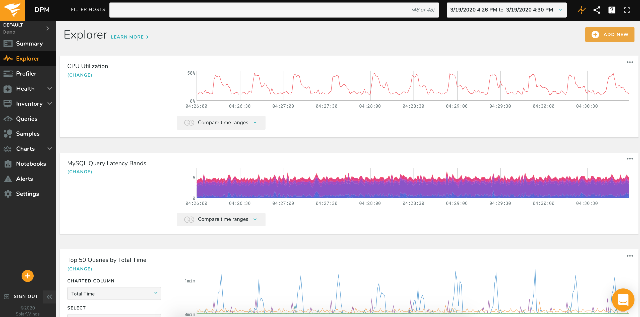
Here’s an example. If you see on your DPM Summary page that CPU usage has increased, you can use the Explorer to view CPU utilization alongside query data, letting you quickly determine if queries are running more frequently, taking longer, or perhaps not using an index when they should.
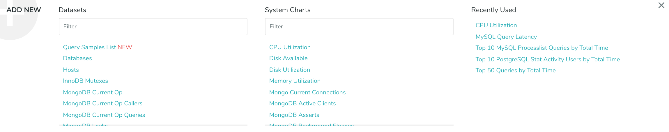
Explorer is made of two kinds of View: System Charts, which include things like CPU Utilization, database cache activity, etc.; and Datasets, which are ranked data such as the most time consuming or frequently run queries. You can stack Views on top of each other, letting you see the relationships between queries, database performance, and system metrics.
You can add views by clicking the orange “Add New” button at the top right of the page, or by clicking on the “+” icon which appears when you hover over the space between Views.
System Charts
System Charts visualize database or system performance over time, such as CPU utilization or the number of open connections. Select the data you wish to see from the list, which includes all of the Charts available in DPM - the same ones that you see on the Charts page. You can search through the list to find the chart you’re looking for faster.

Hover over the chart to see the value at a specific point in time. This will also highlight that point in time on the other Views, allowing you to correlate changes in metrics.
Datasets
Datasets are ranked data, such as the most time-consuming Queries and Users who have executed the most queries.
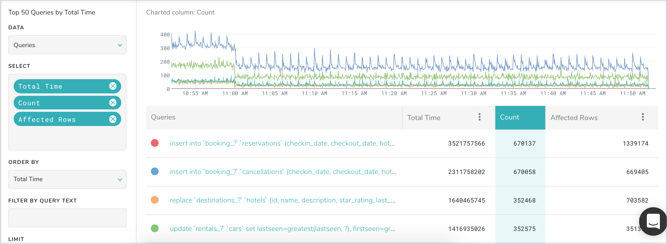
Each section of the Dataset View is described below:
Data: Select the category of data to view. This includes query data as well as processes, locking information, and other workload data. This defaults to displaying “Query” data. The options available will depend on what database type you are monitoring.
Select: Choose the columns you want to display. The available columns will depend on what Data you have selected to rank. To remove a column, click the ‘x’ to the right of the column name.
Order by: Choose which metric to rank by for the category of data you have selected above. For example, if you wanted to view your most time-consuming queries, you would select “Queries” as your Data and “Total Time” as your Order by.
Filter by Query Text: When ranking queries, you can search for a specific query digest (or part of a digest). To search, just enter your search and click “Apply.”
Two special characters are accepted in search:
*will match any number of any characters. For example,select * customerswill find any query which contains the wordselectfollowed by the word customers anywhere in the digest. To match a literal*, you can escape using\; for example,select \* from customers.^will match the beginning of the digest. For example,^insert into customerswill find all digests which begin withinsert into customers. As in this example, this is useful to find all queries with a specific query verb which affect a certain table.
Limit Select how many rows to display in your results, up to 50.
Charted Column
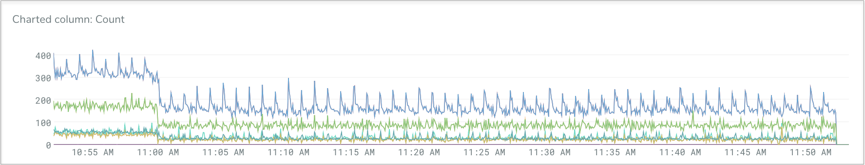
The chart above the table displays one of the metrics chosen in the Select, such as query execution count, for the top 10 rows in your results.
To change what data is being charted above the ranked results, first add that metric in the Select to include that data in the table. (Any column you choose in your Order by will automatically be added to the Select columns.) Once added, you can click the three dots next to the column title and choose “Chart This Column.” Some data is only available in aggregate and cannot be charted.
Hover over the chart to see the value at a specific point in time. This will also highlight that point in time on the other Views as well, allowing you to correlate changes in metrics.
Up to 10 rows can be charted at a time. Hovering over a row of the table will highlight that row in the chart above. You may wish to eliminate rows of data from the chart if they are not relevant to your analysis. To remove a line of data from the chart click the colored circle to the left of a row. Click the circle again to graph it again.